CARS.COM — The multimedia systems tested in the Cars.com 2016 Compact SUV Challenge ranged from bare-bones basic to top-of-the-line touch-screens with smartphone integration, multiple USB ports and near-seamless usability. Each SUV offers multiple systems but these were graded on the systems included. The as-tested Ford Escape, for example, came with the most-robust Sync 3, while the Hyundai Tucson had its base multimedia system and not its feature-packed, larger-screen system.
The 2016 Compact SUV Challenge
Results | Multimedia Winners and Losers
Cars.com editors Joe Bruzek, Jennifer Geiger and Bill Jackson had clear favorites after testing the five SUVs back-to-back-to-back over the multiday comparison. Here's their take on which systems worked the best and which ones to avoid. They are listed below in alphabetical order by brand.
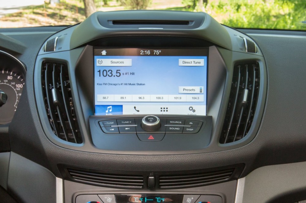
2017 Ford Escape: Sync 3 with 8-inch touch-screen
JB: Winner
What I like most about Sync 3 is that, even without Apple CarPlay and Android Auto, of which it's the holy grail of multimedia by having both, the Sync 3 is still an easy system to use, with an intuitive user interface and big screen. I just wish there was a damn tuning dial instead of tune-seek buttons for the radio.
WJ: Winner
Yeah, a tuning dial would be nice, but I don't see it as a deal-breaker. The best systems are easy to use, whip between menus and generally do what you need them to do. Sync 3 nails all that.
JG: Winner
Both the interface and menu structure are very clean, and the fact that Sync 3 understood my voice commands the first time is hugely impressive; MyFord Touch consistently (and frustratingly) failed with that, as do many other systems.
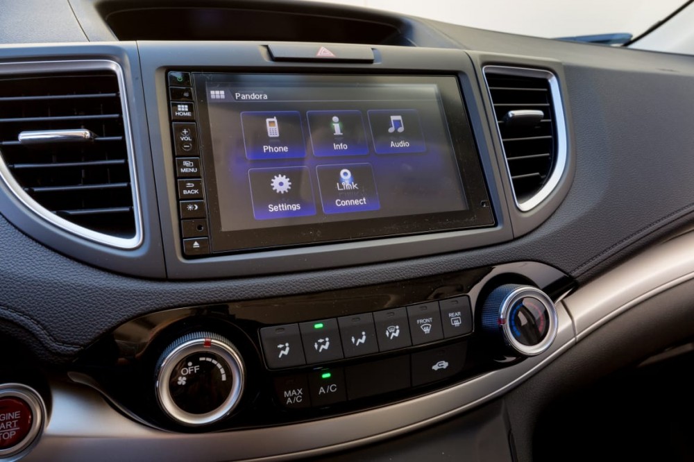
2016 Honda CR-V: Display Audio with 7-inch touch-screen
JB: Loser
The saving grace of the CR-V's multimedia system is its seamless Pandora integration via USB or Bluetooth. Otherwise, the HDMI-powered HondaLink's app offering is limited, requires a digital converter that'll cost you to add and the tactile buttons are no replacement for a volume or tuning dial.
WJ: Loser
I'm not sure we can call this a multimedia system. I stopped trying to use it because it made me want to punch something.
JG: L.O.S.E.R.
I preferred to sit silently with my thoughts rather than use this sham of a system. It's maddening, from its pinky-sized buttons and lack of knobs to the fact that it takes two steps to mute the sound.
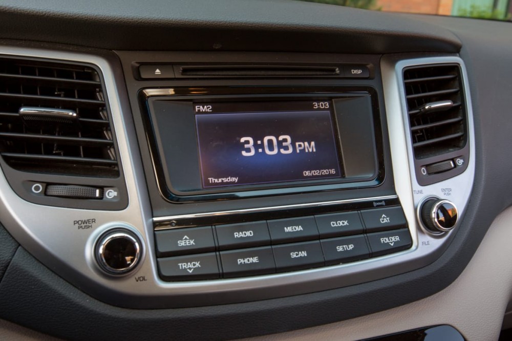
2016 Hyundai Tucson: 5-inch touch-screen
JB: Loser
C'mon. A 5-inch touch-screen? I understand Hyundai can't put its premier 8-inch touch-screen in every model but this Tucson, as-tested at $28,570, was the priciest SUV tested and had the smallest screen and fewest smartphone integration features.
WJ: Loser
It's teeny! And you know what's nice when it's teeny? A kitten. A puppy. A baby duck. Those are cute little things. But not multimedia screens; they should be large. And, as Joe points out, not only is it small, but it doesn't do much.
JG: Loser (barely)
Guys, size isn't everything. The system gets points for having volume and tuning knobs and a responsive touch-screen, but it loses points for its dumbed-down, circa-2010 Pandora interface. (But yes, those dinky buttons required a lot of dexterity to use accurately while driving.)
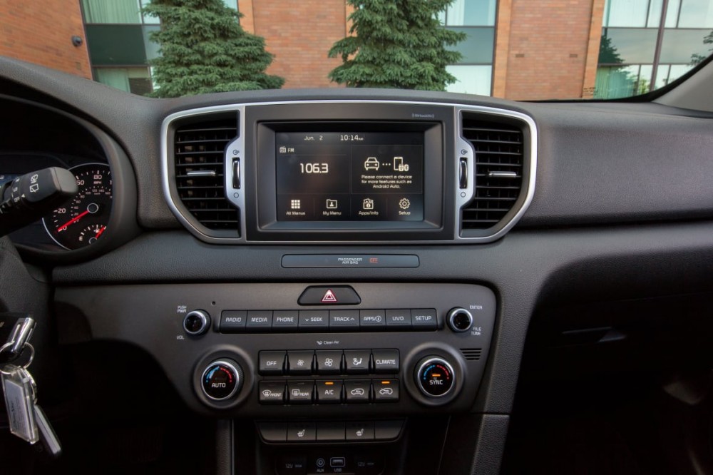
2017 Kia Sportage: UVO with 7-inch touch-screen
JB: Winner
The Sportage's 7-inch system was just a feature away from taking the Escape's crown. Our test car did not have Apple CarPlay, though it has been added to production models since. I would have scored the Kia higher because it has dials both for volume and tuning.
WJ: Winner
Not only did it have the dials, the UVO system was quick to respond and featured numerous physical buttons to help move through the various functions. It's a solid system that would win many other contests, just not this one.
JG: Winner
UVO is the unicorn of the bunch with a large, clean interface, responsive touch-screen and the knobs. It's a favorite for its simplicity both in terms of how it looks and how it works. Bonus: Connecting my phone to Android Auto provided seamless navigation.
2016 Toyota RAV4: Entune Audio Plus with 6.1-inch touch-screen
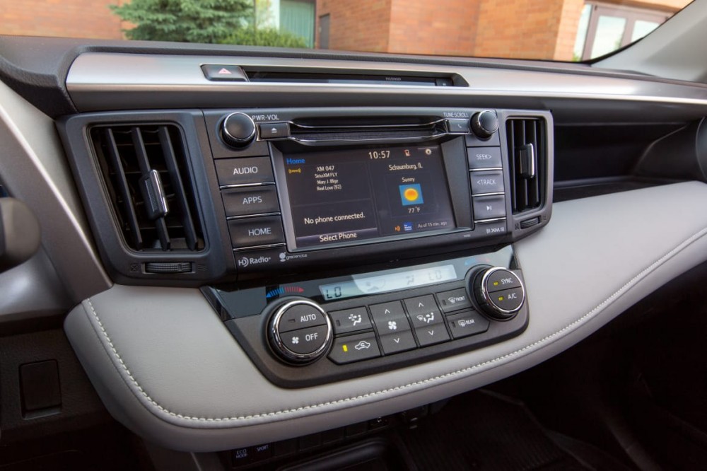
JB: Loser
The RAV4's midtier Entune Audio Plus system didn't have the application offerings of the pricier Entune Premium Audio, so it came up short on features against the competition. It did, however, include integration of the Scout GPS smartphone app that mirrors navigation to the touch-screen and, unlike the Honda that does something similar, the Toyota uses a regular USB cable and the app is free.
WJ: Winner
This one is tough, though, because even though Joe is correct about the flaws, the system is pretty easy to use. It's not hard to figure out and you can flip between the various systems easily, even if some of the menu setups aren't the most convenient. It's right on the edge but I'm nudging it to a winner.
JG: Winner (barely)
This one's a mixed bag — it's a mess visually with a mix of knobs, panel buttons and a touch-screen, but screen size is decent and there's no learning curve when it comes to using it.


