CARS.COM — The 2018 Land Rover Range Rover Velar, which we'll just call the Velar from here on out because that's a lot to read (and type) each time, is a very attractive SUV. At the 2017 New York Auto Show, we had a chance to take a good look at the Velar's sharp exterior styling, but we didn't get much time with the interior — until now.
Related: 2018 Land Rover Range Rover Velar Preview
It's not just the Velar's outside that looks sharp. The interior is attractive in a thoroughly modern, minimalist way, accentuated by a brand-new twin-touchscreen system for media, navigation, climate and vehicle controls. Land Rover calls the system Touch Pro Duo, referring to the two touchscreens — one in the traditional location and the other that blends into the center console where buttons and climate controls would normally reside. This was our first chance to get hands-on time with the next-gen system, which Land Rover told me would likely proliferate to other products in the near future.
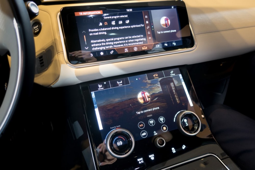
The touchscreens are the same width, but the top one has a wider aspect ratio. The top screen functions like a traditional touchscreen controlling audio, navigation and other controls. The screen tilts up to 30 degrees forward and back for comfort (altering the viewing angle for driver height and reducing glare) and has customizable panels on the home page so the driver can choose the screens that are most relevant.
The larger bottom screen has separate menus for climate, seat and vehicle settings. Two dials at the bottom of the screen slightly intrude into the screen space and serve important functions. On the climate screen, for example, the left dial changes the temperature and the right controls fan speed. Move over to the vehicle screen and the left dial now controls the terrain management system. Between those two dials is one important dial I was happy to see: a rotary knob for volume control.
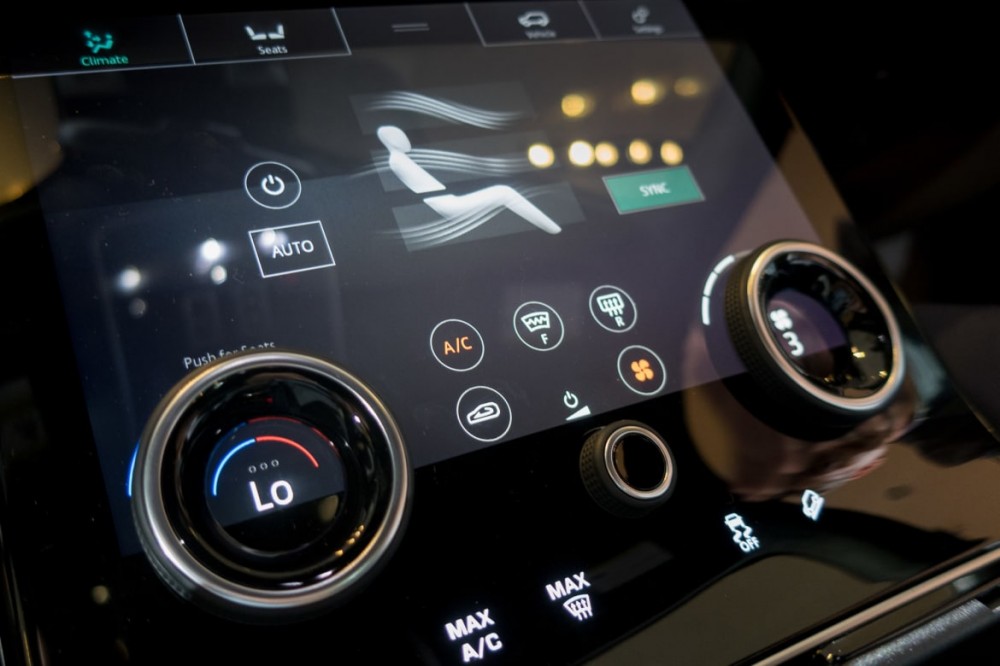
Flipping through the bottom menus was quick. There are no real sub-menus to enter, so the three screens (Climate, Seats and Vehicle) display all the information on their main page so you won't be digging into multiple screens to get what you want, at least on the bottom screen.
As snappy as the system's operation was, I couldn't help but think that this system would be hard to use while driving. There's almost no way to control any of the functions without looking down for an extended time. Looking at the top screen, the buttons are laid out nicely, but they are small and will be hard to hit while moving even while looking directly at the screen. Also, the screen is a fingerprint magnet. It will undoubtedly be necessary to carry a cleaning cloth of some kind.
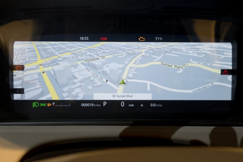
Land Rover also replaced the traditional instrument panel with a screen. Though it isn't the first automaker to do this (Audi does something similar with Virtual Cockpit), its setup is unique in that some screens can completely remove the tachometer/speedometer. Hop into navigation mode, expand the map and the speedometer drops all the way down to a small number on the bottom.
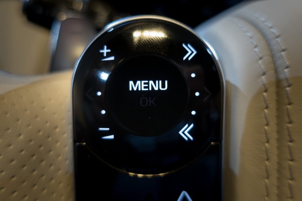
This digital instrument panel is mostly governed by a thumb control on the left side of the steering wheel. The thumb control also changes its appearance depending on the functionality shown on the screen. Most of the time, it shows volume controls and back/forward arrows for audio tracks, but the appearance of the knob changes once you hit the menu button to activate the screen. The button is touch-sensitive, so running your thumb around the rim of the button scrolls though the menu options. This functionality wasn't working well when I tested it, but the vehicle was a preproduction model, so there's a possibility Land Rover will fix the issue when the Velar hits dealerships in early September.
Though the interior styling is minimalistic, the number of display possibilities in the Velar is anything but. The Velar's undoubtedly cool interface reminded me of something from the Apple design studio, not Land Rover. The menus are visually attractive and well-laid-out, and the screen itself has high-enough resolution to look sharp even though it's pretty large.
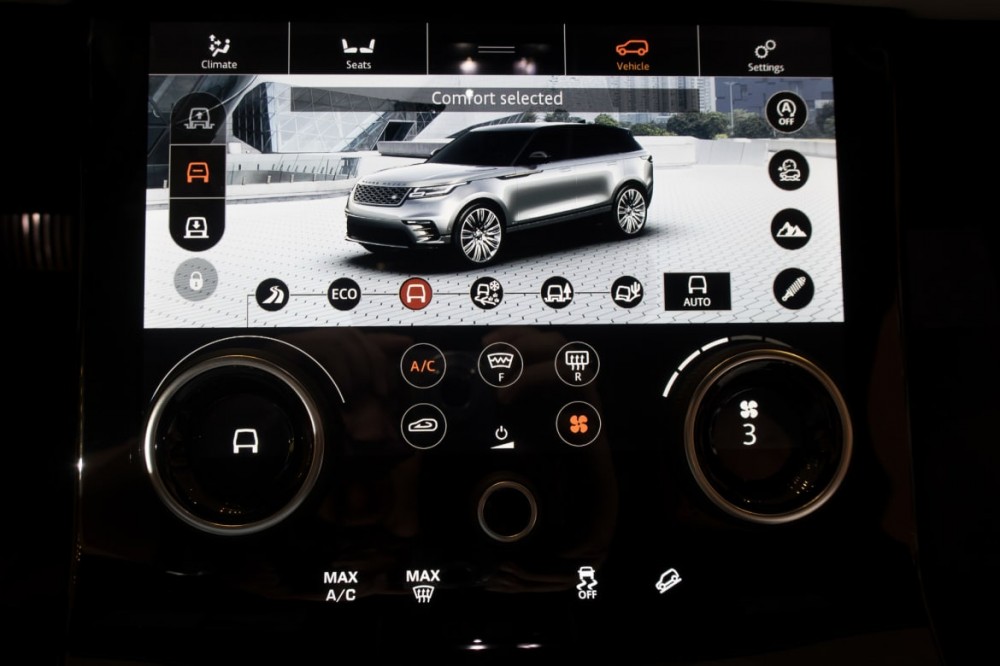
However, my hesitation is this: How easy will it be to use while driving? It's hard enough to land on a physical control when you're behind the wheel; imagine trying to land your finger on a half-inch-diameter button on a flat panel while all the buttons around it are equally touch-sensitive. We will report more when we get to drive a production version of the Velar, but at first use, the system is like a work of art in a museum — real pretty to look at, big trouble if you touch it.


